Experiments
How-To: Setup a Treatment/Control Group for an Audience
In this article, we will walk through the steps to set up a treatment/control split for an experimental audience. If you are curious what this treatment/control split does, how to pick the appropriate split sizing, or tips for maximizing your chances of achieving statistical significance in your campaign evaluation, we highly encourage you to check out our GrowthLoop Campaign Evaluation Methodology Explained article.
Step 1: Build your Audience
Creating your experimental audience is easy with GrowthLoop Audience Builder! Simply apply the Flex Filters necessary to narrow down your customer segment to just those fitting the desired criteria. Step-by-step instructions for how to do this can be found here if needed.
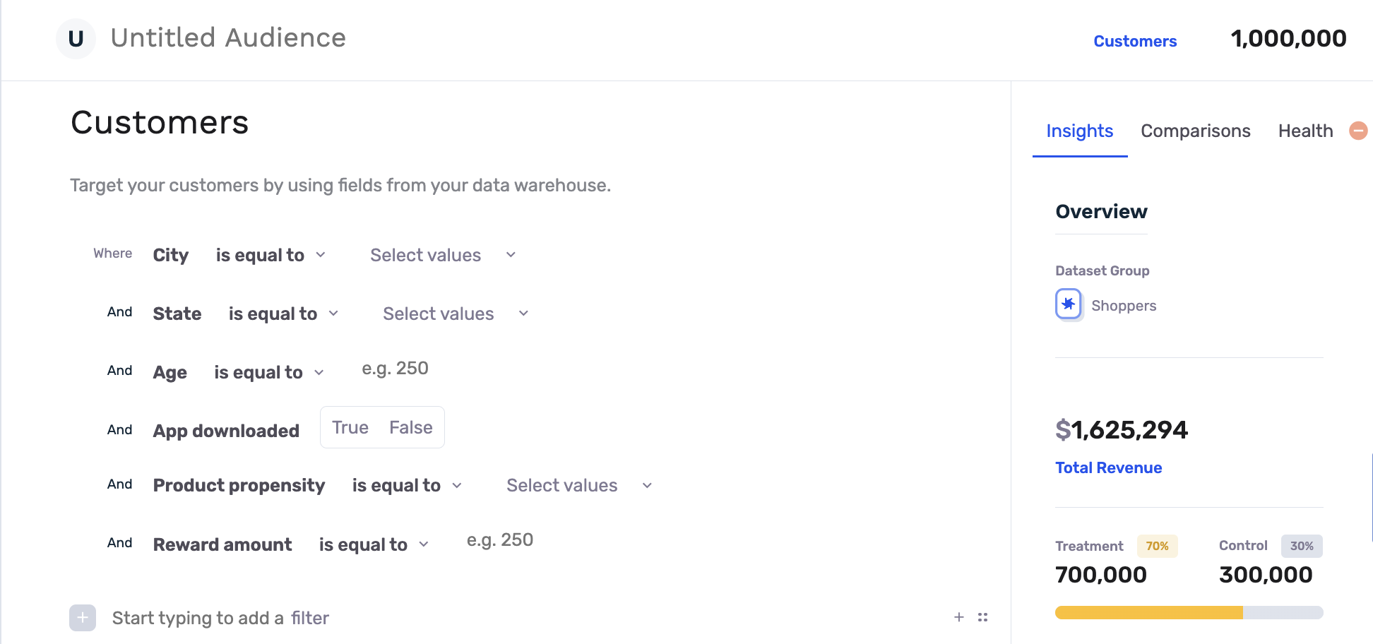
Step 2: Select your Treatment/Control Split
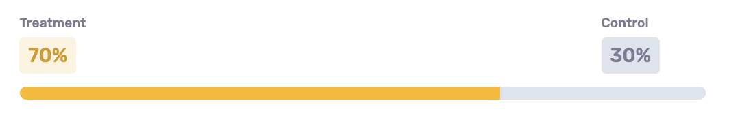
Before you save your audience, take a look at the Audience Report on the right hand side of the screen. Here you can see a live view of how many customers fit the criteria defined by the selected Flex Filters. You can also move the slider to adjust how many customers fall within the treatment group (who receive the marketing or sales intervention), and those who fall within the control group (who do NOT receive the intervention for this specific campaign). The default split shown is not necessarily a suggestion, but rather the default split established in the settings of your Audience Builder dataset, and can be changed at any time.

There are several trade-offs to keep in mind when selecting the Treatment / Control Split percentage:
There is often the temptation to bias the sample towards the treatment group in order to maximize the number of users receiving the marketing or sales intervention. Generally speaking, however, the best experimental comparisons between treatment and control groups will be achieved when the size of the groups is similar.
That said, the overall size of the audience matters a great deal when using statistical significance testing to evaluate the effectiveness of a campaign. Larger treatment group splits can be warranted if the overall size of the audience is suitably large.
When in doubt, GrowthLoop can perform what is called a Statistical Power Analysis - an analysis used to determine the minimum sample sizes and effect size (% incremental benefit in the treatment group) required to achieve statistical significance in an experiment.
Common Approaches to Treatment/Control Split:
When evaluating "evergreen" campaigns - campaigns that will be active on an ongoing basis and apply to any new users who qualify - many marketers will opt to split their campaign into two distinct phases.
In the first phase (the assessment phase), a robust control group will be used to ensure a proper determination of the campaign's effectiveness can be achieved.
In the second phase, assuming the assessment phase resulted in a sufficiently impactful incremental performance boost, the size of the control group will be reduced to ~20% (depending on audience size) to maximize the impact of the campaign while still retaining the ability to track the campaign's performance directionally.
Step 3: Save your Audience and Begin Export to Destination(s)
Once you are happy with the treatment/control split, all that is left to do is to save your audience and begin exporting it to your desired marketing or sales destinations! Campaign Evaluation will kick off automatically and will analyze the behavior patterns of those customers who fall in the treatment group and compare to those in the control group.
GrowthLoop Campaign Evaluation Methodology Explained
GrowthLoop's in-app campaign evaluation tools are a powerful way to analyze the impact of your campaigns on a wide array of business values and outcomes, all in near real-time.
Our Campaign Evaluation is based on a treatment/control experimental framework, otherwise known as frequentist A/B testing - an approach that quantifies the incremental improvements in business outcomes driven by your campaigns and supports them with robust statistical significance testing.
This guide is intended to explain and inform the various decisions that must be made when designing an experiment and to detail how GrowthLoop's evaluation methodology functions, both from a general and technical perspective.
.png)
Snapshot View: Campaign Evaluation in-app for an experimental audience
.png)
Snapshot View: Revenue Uplift generated when comparing treatment vs. adjusted control audience segments
Selecting a Treatment / Control Split
Campaign evaluation begins during audience creation when the treatment/control split is set.
The Treatment / Control experimental design relies on using 2 (or more) experimental groups that are drawn from the same population (meaning the qualification criteria for both groups are the same).
The treatment group receives the marketing or sales intervention, while the control group does not. Because these two groups are drawn from the same population, the only difference between them is the intervention itself. Their behavior can then be compared to isolate the incremental impact of the intervention on any number of business metrics, such as revenue generated, app logins, email opens, etc.
Toggling the treatment/control split within the GrowthLoop Audience Builder is simple - just move the slider!
There are several trade-offs to keep in mind when selecting the Treatment / Control Split percentage:
There is often the temptation to bias the sample towards the treatment group in order to maximize the number of users receiving the marketing or sales intervention. Generally speaking, however, the best experimental comparisons between treatment and control groups will be achieved when the size of the groups is similar.
That said, the overall size of the audience matters a great deal when using statistical significance testing to evaluate the effectiveness of a campaign. Larger treatment group splits can be warranted if the overall size of the audience is suitably large.
When in doubt, GrowthLoop can perform what is called a Statistical Power Analysis - an analysis used to determine the minimum sample sizes and effect size (% incremental benefit in the treatment group) required to achieve statistical significance in an experiment.
Common Approaches to Treatment/Control Split:
When evaluating "evergreen" campaigns - campaigns that will be active on an ongoing basis and apply to any new users who qualify - many marketers will opt to split their campaign into two distinct phases.
In the first phase (the assessment phase), a robust control group will be used to ensure a proper determination of the campaign's effectiveness can be achieved.
In the second phase, assuming the assessment phase resulted in a sufficiently impactful incremental performance boost, the size of the control group will be reduced to ~20% (depending on audience size) to maximize the impact of the campaign while still retaining the ability to track the campaign's performance directionally.
Treatment / Control Assignment
Random Assignment
The most common approach to splitting users into Treatment and Control groups is Random Assignment. In this methodology, users in the audience are assigned randomly to either the treatment or control group based on the treatment/control split selected during audience creation. By randomly assigning users between treatment and control, we avoid introducing any bias outside of the experimental intervention itself. The end result of this assignment is two experimental groups that match the specified sizing percentages.
Random Assignment is the default approach implemented in the GrowthLoop app.
A few technical notes on GrowthLoop's implementation:
In the case of ongoing campaigns, when new users are added to the audience, the same random assignment approach is implemented on the entire group of newly qualifying users regardless of whether the current 'active' size of the treatment and control groups matches the split percentage. Functionally, this means that over time the cumulative treatment/control split percentage will match the specifications, but at any given time after the audience's creation, because users may drop from the treatment/control groups at different rates, the 'active' size counts may diverge slightly from the expected ratio.
Considerations:
- While Random Assignment is a widely-used and well-understood methodology for group assignment in this experimental framework, it does have several drawbacks in the context of marketing campaign evaluation. Random Assignment works best in controlled experimental settings where all outside influences are mitigated. Marketers will often have several campaigns ongoing at any given time, however, and the audiences for these campaigns may overlap. This leads to situations in which a given user may appear in multiple treatment groups or the treatment group for one audience and the control group for another audience - introducing noise into the experiment.
- Because users are randomly assigned between treatment/control in all of the affected campaigns, the experiments remain statistically independent, and as such these overlaps do not invalidate the random assignment approach. However, they do make it more challenging to establish statistically significant incremental effects, due to the performance of the control group being inflated by users who are also in the treatment group for other campaigns.
- Users retain their control/treatment label over the entire duration of their membership in a given audience, meaning that if a user exits and then re-enters a given audience, they will be assigned the same label.
Global Control
In order to contend with the audience overlap issue discussed above, some organizations opt for the use of a Global Control Group in lieu of Random Assignment.
GrowthLoop can implement a Global Control Group Methodology upon request.
The Global Control methodology functions by randomly reserving a modest percentage of the overall marketable user base, generally somewhere in the neighborhood of 10-20%, and withholding all marketing from these users. As new users are acquired, the same methodology is used to add a percentage of new users to the global control based on the predetermined split.
Audience definition happens the same way, but instead of randomly assigning all qualifying audience members based on some predetermined split, the control group for any given audience consists of the overlap between the qualifying audience and the global control group.
Functionally, this means that no user ever ends up in both a treatment and control group simultaneously - the global control represents a true baseline when evaluating the effect of marketing compared to no marketing at all. We, therefore, would expect less noisy measurement of incremental performance improvements.
However, because the global control group is randomly assigned and generally only ~10-20% of the total population, we would also expect the size of the control group for any given audience to closely match the overall split. Depending on the overall size of the audience in question, this can lead to situations in which the control group is too small to achieve reliable, statistically significant comparisons with the treatment group.
In Summary:
Some questions to consider when selecting a treatment/control split are...
- How saturated is your marketing environment? How possible is it that a given user will qualify for two marketing campaigns simultaneously? The development of a distinct lifecycle segmentation can help greatly in mitigating the risk of multiple marketing efforts conflicting with one another.
- How large is your overall customer base? How large are the individual audiences that you generally target?
- What effect size/incremental performance boost do you generally expect from your marketing campaigns?
Both approaches have their advantages and disadvantages, along with strategies that can be used to mitigate their shortcomings. We are always happy to engage in a conversation about which approach best suits the needs of your business.
Defining and Calculating Metrics
Once the audience is defined, audience members are split into treatment and control groups, and the treatment group has started receiving marketing or sales intervention, we can start the evaluation.
Because GrowthLoop's campaign evaluation platform sits directly on top of your data warehouse, we can compare the performance of the treatment and control groups across any event we can tie to the customer level. We call these Metrics, and they come in two different flavors: Aggregations and Conversions.
As the name suggests, Aggregations involve aggregating events (or the values associated with those events) over time. Aggregations first happen at the user level (e.g. how much has each user spent since joining the campaign), and are then aggregated again up to the audience level (e.g. how much have all users in the treatment group spent so far during the campaign). We can either count the number of times some event happened, or sum up all the values associated with events that took place (like the amounts associated with transactions).
Some examples of Aggregation Metrics:
- Total spend in the treatment group vs. control group during the duration of the campaign
- Total number of transactions in the treatment group vs. a control group that took place within 60 days of the user being added to the campaign
- Total number of logins in the treatment group vs. control group during the duration of the campaign
At the customer level, Conversions capture whether an event happened or not. The only possible values for a conversion metric are True or False. At the audience level, conversions represent the number or percent of users in the group that converted.
Some examples of Conversion Metrics:
- Number/Percent of users who made at least one transaction during the campaign in the treatment group vs. control group
- Number/Percent of users who purchased a specific product/service during the campaign in the treatment group vs. control group
Understanding Adjusted Control and Lift
As discussed in the 'Selecting Treatment / Control Split' section above, it is often the case that the Treatment and Control groups are different sizes. When this is the case we need to normalize our metrics by group size in order to reach an 'apples-to-apples' comparison.
For example, if we have 80 users in the treatment group, 20 in the control group, and everyone spends $10, it's clearly wrong to assume that the $800 total spend in the treatment group outperformed the control group with $200 total spend. If we normalize the spend by the group size, we get $10 spend per user in both treatment in control. In other words, there's no difference in performance.
In order to arrive at the adjusted control version of a metric, we first normalize the control metric by group size, and then multiply it by the size of the treatment group. This allows for an apples-to-apples comparison between the two groups, framed in terms of the actual incremental benefit of the treatment.

The full calculation for the example above is as follows:

The AdjustedControl metric = $800, which is the same as Treatment meaning there was no incremental benefit to this campaign.
Let's now consider the same example but where the Total Revenue metric for the Treatment group is instead $1000. In this case, when we compare the Total Revenue of Treatment to Total Revenue of AdjustedControl we get an incremental benefit (lift) of $200 for this campaign.

In other words, if we had not run the campaign, we would have expected the users in the treatment group to spend a total of $800, resulting in a total of $1000 for the audience as a whole. Instead, we registered $1200 in spend, meaning the campaign generated an incremental benefit of $200.
A few considerations to keep in mind when working with Adjusted Control metrics:
-
Percentages are already normalized by population size, so an additional adjustment isn't necessary.
-
If the size of the control group relative to the test group is very small, outliers in the control group can have an outsized impact on the adjustment metric due to being multiplied by the size of the treatment group. This is only relevant to aggregation metrics, and it's possible to include outlier adjustment on a per metric basis to account for this.
Now that we understand how Lift is calculated, let's take a closer look at Statistical Significance Testing - The methodology that is used to determine whether an observed difference between the performance of treatment and control groups is real vs. due to random chance.
Implementing Significance Testing
Why Statistical Significance?
Evaluating campaign success based on performance metrics on their own is helpful in understanding how a campaign is tracking directionally over time, but when it comes time to make an important decision about whether a given campaign should be expanded or whether it should be scrapped, how does one determine what level of performance is good enough? There are a variety of situations that can make it difficult or unreliable to make this assessment based on looking at metrics and lift alone. Inadequate audience/sample sizes, the presence of a few big outliers, and/or an inordinate percentage of your control group happening to be in the Bahamas during your experiment are just a few examples of issues that may lead to misinterpreting the likelihood that a given incremental benefit will be replicable in the future.
Significance testing is the statistical methodology used to assess how likely it is that an observed difference in performance between a treatment and control group is not due to random chance.
It helps give us confidence that the observed difference is actually due to the intervention on the treatment group, and therefore if we continue outreach to this audience using the intervention, we will continue to observe a similar effect.
The two primary measures used to calculate statistical significance are the metric in question and the audience sizes (referred to as sample size). In both cases, more is typically better. If the observed difference between treatment and control (effect size) is large, statistical significance may be reached even for a campaign with a small sample size. Similarly, if the sample size for an audience is very large, we are more likely to be able to conclude that even a small performance difference between treatment and control is not due to chance. (Note that just because a small performance difference is not due to chance, it doesn't necessarily indicate that it was worth the cost to achieve it!)
Understanding Confidence Intervals
When statisticians talk about statistical testing, it is framed in terms of what is called the null hypothesis. The experimenter's hypothesis is that the treatment intervention is going to have a real impact on the behavior of those who receive it. The null hypothesis, conversely, is the opposite - the base assumption that any difference in treatment vs. control is due to random chance. Significance testing, therefore, is used in an attempt to reject the null hypothesis.
Significance tests always come hand in hand with something called Confidence Intervals. If you've worked with significance testing in the past, you've probably heard something along the lines of... "The effect is significant at a Confidence Interval of 95% or .95." This is another way of saying that there is at least a 95% chance that the observed effect is not due to chance. The Confidence Interval represents the probability threshold at which the experimenter is willing to reject the null hypothesis. The higher the Confidence Interval, the more difficult it is to reach statistical significance. Larger effect sizes and sample sizes both contribute to higher statistical confidence.
Fundamentally, the decision of what Confidence Interval to use is made by the experimenter, or often the organization or marketing department as a whole. There is no right or wrong way to make this determination - it's based on how much tolerance one has for the risk of incorrectly rejecting the null hypothesis, which often depends on the nuances of the experiment or business context. Academic researchers, for example, often have to go through a rigorous review process before their work is accepted for publication by a journal, and as such generally demand a high level of confidence in their findings. Confidence Intervals of 95% or even 99% are often used. When evaluating marketing or sales campaigns, however, statistical confidence can be harder to come by and the stakes of getting it wrong are generally far less. As such Confidence Intervals of 90% or even 80% are not uncommon.
Choosing the Right Significance Test
There is a large variety of Significance Tests that have been developed for this type of experimental validation. This variety exists to handle the nuances presented by different experimental frameworks and metrics.
GrowthLoop defaults to the use of just a few tests in our campaign evaluation framework:
- t-test / z-test: Parametric tests used to compare two sample means when evaluating normally distributed metrics
- Mann-Whitney U test: Non-Parametric test used to compare samples that are not normally distributed.
**How-To: View Revenue Uplift for your Audience**
In this article, we will provide step-by-step instructions for how to view our most commonly requested metric - Revenue Uplift - as part of GrowthLoop Campaign Evaluation.
Step 1: Ensure you have an Audience exporting to a destination with a treatment/control split

In order for Campaign Evaluation to begin, you must have an exported audience with a treatment/control split that has some percentage of customers in each group. You can quickly check which audiences fit this criteria when you open up Audience Builder and search through your saved audiences on the home page. The 'Status' column must show 'Exported' and the 'Treatment / Control' column must show any split that isn't 100%/0% (indicating that you exported the audience with zero customers in the control group).
Once you have identified a qualifying audience and would like to analyze its associated Campaign Evaluation, simply click the audience name to open up the audience.
Step 2: Scroll to the 'Performance' graph that populates for all qualifying audiences

This 'Performance' graph is your window into GrowthLoop Campaign Evaluation. This graph will quickly identify the total number of customers that have entered your audience over time, along with the performance over time of the selected Metric and Value Type.
The above screenshot reveals that 2,494 customers has qualified for the example audience over time, based off the Flex Filters applied in Audience Builder. The Metric selected is 'Customer Count' and the Value Type is 'Total', revealing a time graph of the total number of customers entering or exiting this audience over time. We can click the dropdown boxes in the upper right hand corner to change the visible Metric and Value Type.

Please note: these Metric options are entirely configurable to fit your needs. Since we hook directly into your data warehouse, we can provide customer performance evaluation on any number of metrics available. This can include revenue, app logins, email opens, opportunities won, etc. Please reach out if you have any questions or need different Metrics enabled for your Audiences!
Step 3: Select 'Metric: Revenue' in the Metric dropdown box
In order to analyze Revenue performance of an audience, we must first select the Revenue metric from the Metric dropdown box. This will reveal Revenue totals for the Treatment, Control, and Adjusted Control groups over time.

Since the treatment/control split for the example audience above heavily favored treatment sizing over control, it is expected to witness overall greater revenue totals out of the Treatment group (blue) vs. the Control group (red). But in order to perform an 'apples-to-apples' comparison of these groups, we appropriately scale the Control group's revenue to equate to the number of customers in the Treatment group, resulting in the calculated Adjusted Control (green) performance. The Uplift generated is effectively the difference between the Treatment group and the Adjusted Control Group.
Step 4: Select 'Type: Uplift' in the Value Type dropdown box
To graphically see the difference in these two curves as a calculated Uplift metric, all you need to do is select 'Uplift' in the Value Type dropdown box.

Assuming your campaign is 'successful' like the example audience shown, you will have a calculated Revenue Uplift total presented to you upon selecting 'Metric: Revenue' and 'Type: Uplift' from the dropdown boxes! Check back frequently to observe how this performance changes over time. If the campaign is successful, you should expect to see a positive uplift that hopefully grows over time, indicating that this could be an effective audience to target for future campaigns as well.
How to determine if a campaign is 'unsuccessful'?
It should go without saying that, in reality, there are MANY variables and metrics to consider in determining if a campaign is truly successful or not. Revenue, while often an important metric, is just one of these variables to ultimately consider.
With GrowthLoop Campaign Evaluation, you have the power to quickly observe if Revenue Uplift is being generated via your experimental audience by comparing the treatment vs. control groups. This, combined with the ability to experiment and learn quickly, are just a few of the many reasons our clients have chosen GrowthLoop services.
Let's say you launch an experimental audience and begin seeing revenue performance that looks like the following:

From the above graph, we can observe that the Treatment group was outperforming the Adjusted Control group for some time, but then suddenly that performance reversed over the course of about 2 weeks. Now the Adjusted Control is generating greater total revenues than the treatment. The reason for 'why' this happens is not always obvious and may require further investigation. But ultimately we must be realistic that this specific campaign may not be generating revenue lift any further. This doesn't mean you are 'losing money', but rather that the Control group is now spending relatively more than the Treatment group for whatever reason. The resulting Uplift graph would then resemble:

While this result may be disappointing to observe at first, it is important for the growth of your sales and marketing teams to observe and learn quickly. This may indicate that the selling efforts and/or creative is not as effective with the target audience as initially expected and empowers your teams to test and pivot faster than they likely could before.
How to Evaluate Campaigns with Automated Campaign Evaluation Service****
Campaign evaluation is a crucial step in the marketing process to determine the effectiveness of your campaigns. At GrowthLoop, we understand the importance of gaining insights from your marketing endeavors. That's why we offer a powerful Automated Campaign Evaluation Service, allowing you to not only assess your ongoing campaigns but also retrospectively measure their performance. In this guide, we will explore into what this service entails, its benefits, and provide you with a detailed, step-by-step tutorial on enabling Campaign Evaluation to elevate your marketing strategies.
What is Campaign Evaluation?
Campaign evaluation involves assessing the performance and impact of your marketing campaigns. It helps you answer questions like:
- Did my campaign lead to increased sales or conversions?
- How much revenue did my campaign generate?
- Would customers have made purchases without the campaign?
GrowthLoop's automated campaign evaluation service allows you to perform statistical A/B testing, helping you compare the behavior of a treatment group (those exposed to your campaign) with a control group (those not exposed to the campaign) to measure the true impact of your marketing efforts.
Why Use Campaign Evaluation?
GrowthLoop's campaign evaluation service offers several advantages:
- Automation: The service is fully automated, eliminating the need for manual intervention.
- Data Warehouse Compatibility: The service is compatible with various data warehouses, making it adaptable to your specific infrastructure.
- Cost-Effective: It offers cost savings as it only evaluates audiences when explicitly activated and for a specified time period.
Understanding Metric Types
Before diving into campaign evaluation, it's important to understand two types of metrics:
- Count Metrics: These metrics count specific actions taken by customers, such as the number of customers who attended an event or made a purchase. It focuses on conversions.
- Sum Metrics: These metrics measure the total value of specific actions, such as the total revenue generated from purchases. They detect uplift rather than conversion.
Enabling Campaign Evaluation
Here's a step-by-step guide on how to setup Campaign Evaluation using GrowthLoop:
Note: Contact your Solutions Architect Manager to enable Campaign Evaluation in your account!
Step 1: Make sure you have an exported audience with a treatment/control split.

To start the Campaign Evaluation process, it's essential to have an audience that has been exported and divided into treatment and control groups with some customers in each group. You can easily verify if you have such audiences by going to Audience Builder and checking your saved audiences on the home page. Look for audiences with a 'Status' of 'Exported' and a 'Treatment / Control' split that isn't 100%/0%, which indicates that there are customers in both groups.
Note: Learn how to setup a treatment/control split for an audience here.

Choose the dataset type Transactions or Events.

Choose the dataset and table that houses the metric you wish to evaluate. In this example, we will be connecting to the "total_spend" table, which holds the data pertaining to the total revenue generated from customer purchases.

Important — Next, label your data set by specifying columns such as:
- date of the transaction
- revenue
- unique identifier (e.g., transaction ID).

Finally, join the transaction table to your user table by specifying the join key and click Create.

Step 3: View the performance of your audience and understand if your campaign is working (or not!)
Navigate to the audience you want to analyze its Campaign Evaluation.

Select the Performance tab and specify the Evaluation End Date.

After the evaluation runs, select the metric in the Metric drop-down box and you will see the audience performance data.

The Performance graph serves as your portal into the GrowthLoop Campaign Evaluation. This graph provides a swift overview of the cumulative count of customers entering your audience over time. Additionally, it showcases the performance trend of the chosen Metric and Value Type over time.
Conclusion
GrowthLoop's automated campaign evaluation service streamlines the process of assessing the impact of your marketing campaigns. By enabling statistical A/B testing, you can measure the true uplift your campaigns generate. Whether you have treatment and control groups or not, GrowthLoop's service provides valuable insights into your marketing efforts, helping you make data-driven decisions and optimize your campaigns for success.
Updated 2 months ago