Designer Guide
Table of Contents
Getting Started
This page is built to be a reference page and instructional guide for how to work within the Webflow designer in a way that keeps this website organized and clean. It is recommended to view this page on the live url so that you can see the populated table of contents (left), and navigate through the page more easily. Note: All the pages in the dev folder are set to not be indexed by search engines so website viewers won't stumble across them.
What is MAST?
This Website is built based on the MAST design system which is a method for building websites that helps provide consistency and promote best practices for Webflow development. This page is built to be a quick reference page of the core principles so that you can get started updating your website ASAP. Throughout this page there will be links to pages of the full documentation so that you can reference it if you have questions that this page doesn't cover.
Note: this style guide has been modified to be based on variables which the MAST system is yet to support, so there will be differences from the current documentation. Variables are covered in more detail below.
Why bother?
While you could definitely go into this project and start making updates without reading this guide doing so will quickly make the website much less organized, harder to update in the future and could potentially break or modify parts of the site in an unintended way so it is much better in the long run to take 20 minutes and read through this page before making edits to the website. Each main heading has a key takeaway section to help you read this page quicker and keep the most important things in mind.
The Goals of MAST
- To create an organization system for our project
- To enable speed and flexibility when using Webflow Designer
- To define a strategy for class usage in the project
- To standardize a core structure shared across all pages
- To create a Webflow build that is scalable and easily manageable
- To help developers, clients, or anyone understand the project
Class Naming
One of the most important aspects of MAST is class naming, it is a key part of making sure that anyone can go into the Webflow project and make edits easily. The goal of a class name is to help someone be able to look at a class and immediately tell what is used for so they can confidently make changes to it if need be and know if it is affecting the entire site, just a specific component, or even a single page.
Class names should say what they do. When creating a name for a class, we can think of these questions:
- "What is this class doing in the project?"
- "What is the purpose of this class in the project?"
- "How can I give the most context into what this class is responsible for in the project?"
The name of a class should answer these questions.
All class names should be in lowercase. Instead of using spaces, class names will include hyphens and/or underscores based on if they are a utility or a custom class (more information on Utility and Custom classes below).
Mast follows a modified approach to the BEM, short for Block Element Modifier, front-end methodology for naming classes in HTML and CSS. It is a way of structuring and organizing code that makes it easier to maintain and understand. BEM is based on the idea of modularity and encourages the reuse of code. It also helps to ensure that all related code is kept together and is easy to find and use.
- Units: Refer to sizes and scales with numbers relative to their CSS specifications, not abstractions like s, m, l, xl, etc.
- Names: Use meaningful, but short names when describing things. Abbreviate long words when necessary.
- Characters: Only use characters that are also supported by the CSS syntax, so the class names shown in Webflow are identical to the class names rendered in the live HTML/CSS, whenever possible*. This ensures their is semantic consistency from Designer to live code, which also helps if you need to target a class with custom code, although we don’t recommend this per our code best practices.
Breakpoint notation
We use the infix below to reference each of the 4 default breakpoints in Webflow, within certain classes of the utility and layout system of Mast. If you wish to support additional breakpoints, you can follow a similar nomenclature to extend the system.
- lg - desktop breakpoint
- md - tablet breakpoint
- sm - mobile landscape breakpoint
- xs - mobile portrait breakpoint
The four main types of classes
The two main types of classes that you'll be using/creating are Utility classes and Custom Classes. There are more types of classes (Global Classes, and Combo Classes) but the distinction between those is a little more nuanced and so in order to simplify things for this reference page I've left those details out, in order to fully understand how different types of classes interact view the classes strategy page here.
Base Classes
These are foundational classes that are essential to creating common layouts and UI structures. They don’t include a prefix as they often function similar to custom classes in that they may have modifier combo classes added for different variants.
Base class examples:
- section
- container
- row
- col
- h2
- input
- button
Utility Classes
These are modifier classes that are added to elements to quickly modify a finite amount of styling for a specific purpose. Utilties can be added alongside other Utilties, or alongside base classes for simple style adjustments.
They usually don’t have their own Combo classes, and shouldn’t ever be added to a base or custom class which also has a combo already applied (with the exceptions of section classes which have a spacing combo class applied). Utility classes are prefixed with u- to make them easy to identify.
Utility class examples:
- u-text-primary
- u-bg-accent
- u-image-cover
- u-spacer-2
As a general rule you shouldn't have to create new Utility classes for this project, all the utility classes you already need are already set up for you and are are stored on the style guide page so that you can quickly browse through examples of those classes and see what they do.
Each utility class is made for a single purpose and generally shouldn't be modified to fit another purpose. For example, u-text-secondary only makes the color of the text the secondary text color used throughout the site and so it would be bad practice for you to modify it to also have be underlined and aligned to the center. This is because it makes the class name inaccurate, and will often have unintended consequences on other parts of the site where that class is used. Additionally, if you have a text block later on that you just want to be the secondary color you can no longer use u-text-secondary without also affecting the underline and alignment. Instead of doing this you can either stack up to four utility classes to create the desired effect (u-text-secondary u-text-center u-text-underline) or you can create a custom class.
Class Stacking
Class stacking is when you add multiple classes to an element. Stacking classes in Webflow can be helpful but can also create a more confusing and difficult to edit experience so this should be done with care. In the MAST system you should never stack more than four classes, deep stacking classes can cause a lot of hidden issues and also creates difficulties when trying to edit an element. Often when you find yourself doing this you should create a custom class instead.
Rules for working with stacked classes:
- Never stack more than 4 utility classes (the only exception for this is the row and column layout system)
- If you have several stacked utility classes don't modify any of the properties as this creates unpredictable behavior throughout the site and can cause a lot of confusion. For example, if an element has u-text-secondary u-text-center u-text-underline and you need to make a sizing adjustment on the mobile breakpoint you should just remove those classes and make a new custom class instead. The finsweet chrome extension has a some great helper tools for instances like this.
- If you see a combo class like with the is- prefix like button is-secondary you can feel free to modify those properties. Combo classes are a bit more advanced and so if you are a beginner I'd recommend not making new Combo classes without reading the documentation on how they work.
Custom Classes
These are classes that were created for a specific component, or page. These are called "custom" classes because they are custom outside of the project’s utility classes. Custom classes should be created when utility classes can not, or should not, be used on an element. The class is custom to that element. Custom class names use the following convention home-header_heading-wrapper. On the left side of the underscore is the name of the component, this name is meant to describe a group of elements that work together (in this case the home-header component). On the right side of the underscore are keywords meant to describe the specific element the class is for (in this case the heading wrapper).
Custom class examples:
- footer_column
- navbar_link
- testimonial-slider_headshot-wrapper
- services-item_background-texture
All Custom classes use an underscore in the class name
As you'll notice both the component name and the keyword can include multiple words divided by hyphens but the component name is always on the left of the underscore. What this allows you to do is type footer_ into the class input field and see every single class that is made for the footer. This makes it much easier to know what you are modifying and not accidentally create unintended consequences when updating styles.
Naming Custom Classes
When naming custom classes use a name that describes what the component is, both clearly and succinctly. If the component is made for use on multiple pages it can have a more general name like header_component whereas if it made for a specific page the first keyword should reference that page eg: blog-subscribe_component. When you are creating different classes for a component generally the outermost div should have the keyword component as used in the examples above. This helps create a visual separation between components and keeps elements that are named together within one space.
Note that just because you are creating a component does not mean you cannot use base or utility classes within that component. For example you'll often use you'll often have a heading with h2 or a button with button classes that don't need to be named based on the component because those classes are managed globally and are not specific to the component you are working on.
Custom classes are generally used for one of the following purposes:
- Layouts (grids, split layouts etc..)
- Design elements (cards, sliders, light boxes etc...)
- CMS Elements
- Text styles that would require over 4 utility classes
- Webflow interactions
Combo Classes
These are modifier classes prefixed with cc- that are only added to Custom or Base classes to support different variants of a class. Avoid adding both Utility and Custom classes to a single element, and instead just add all style attributes needed directly to the Custom class (with the exception of the section spacing combo classes).
Combo Class Examples:
- header_image cc-narrow
- nav_link cc-cta
Key Takeaways
- Always name your classes! Never leave a class with a default name like Div Block 2 or Image 13
- All class names should be in lowercase and avoid using spaces
- Keywords go from general to specific within a class name
- Never stack more than 4 utility classes
- Do not modify css styles on stacked utility classes, create a custom class instead.
- When making new custom classes default to the following naming convention component-name_element-keywords
- When modifying a class first make sure you understand where the changes are going to take effect. Modifying the home-header_layout should only effect the header component on the home page whereas modifying the text-size-1.5 will affect every text element that uses with that larger size.
- Use utility classes when possible but don't be afraid to create new classes if you need something unique.
Variables
This website utilizes Webflow Variables to set up the design system used throughout the site. These variables can be updated to make global changes to spacing, color, typography and more. Whenever you see a purple value in the styles panel that is referencing a variable, this helps keep the design system consistent.
Some variables control elements on different breakpoints, for example the heading variables allow you to quickly update how each of the headings are sized responsively. heading / h1 controls the size of H1 headings on the desktop breakpoint, for responsive sizes md = Tablet, sm = Landscape, and xs = Portrait. This switching of variables on each breakpoint is controlled in the custom code embed but you shouldn't have to modify that, just keep the variable names the same and they should work as expected. These variables keep both the html tags and the heading style classes in sync so that they are using the same size across each breakpoint.
Using variables in classes
When referencing variables in classes it is important to use the correct ones in order to keep the site consistent, several variables may have the same value but are kept separate in order to make the site more maintainable if the design system changes down the road. Below are instructions for each of the kinds of variables.
Heading Size - For these variables only refer to the main variable within classes (this should already be done for you). The responsive sizes will be switched out using embedded CSS so you can make changes to the variables for different breakpoints without having to update the classes.
Color - The color system uses two sets of variables each with a different purpose. By keeping the swatch variables separate from how the colors are used on the site you can have a lot more flexibility when design updates are made.
- Swatches (eg swatch/dark 1). These variables control the color codes used throughout the site, but they should not be referenced in classes when designing only utilize the color variables below.
- Colors (eg color/text primary). These variables should reference the swatch variables to define colors based on their usage (different types of text, backgrounds, borders etc. When adding a color to a class make sure to select a relevant color variable and not a swatch variable (this can be done by searching for "color" in the variables input field).
Text Family - The text families variables control the typefaces used on the entire site, and the text family variables control which typeface is used in which design element (across headings, paragraphs etc).
Spacing - In general use the spacing variables like size/1.5 to apply margin, padding, and gap sizes across the site. Note, the spacing variables are responsive so they will automatically decrease on tablet and mobile, if needed the responsive values can be updated in the Global Styles Embed.
Core Structure - These variables are unique values that are referenced in the core structure classes throughout the site, feel free to update these as needed if you want to make changes to global spacing and sizing.
Key Takeaways
- Variables control consistent values used across the site and can be updated to quickly make global changes
- Some variables are meant to be referenced in classes, and some are just meant to control values, make sure you are using each variable in the intended way in order to maintain consistency.
- For responsive variables (like heading sizes) a set of infixes are used and they are controlled in custom code, so do not rename any of these variables unless you can update the CSS in the Global Styles embed as well.
Core Structure
Every page on your website uses the following core structure. It uses 4 different layers of Div Blocks and each layer has a specific use in helping you to create a web page. Below are descriptions of each of the classes used in the core structure so you can understand what their role is and use them appropriately. Most of the key values within the core structure classes are managed in Variables for consistency. to update
page-wrapper
The page wrapper class holds every element on the page and is useful for copying and pasting content between pages, on some websites it can also be useful for providing styles to the entire page.
page-main
The main content of the page. Use a <main> HTML tag that wraps all or most of our website content sections.
The nav, footer, and global styles symbols should not be inside this main tag.
Styles are optional in the page-main, they can be added if they are needed.
section
This Div Block wraps an entire section of content. It is recommended to set the HTML tag of this element to <section>. You can do this on the Settings panel of the section element.
Sections come with a default padding but the padding can be adjusted using combo classes(eg cc-large, or cc-bottom-small). The color of the section can be adjused using the global utility classes (like u-bg-secondary, or u-bg-accent).
container
A unified global container system for content on the page. All, or most, page content can go inside the container- class. The container classes center content on the page and set up unified max-width values across the project.
The container comes with a default max with but combo classes can be used to make that larger or smaller.
Key Takeaways
- Use the 4 Core Structure classes above to create consistency throughout the project.
- You can copy and paste the page-wrapper element to easily bring elements from other pages into a new page.
Layout
The MAST system includes a powerful, responsive 12 column system of rows, columns and modifier classes, built with Flexbox and a time tested methodology.
Structure
The grid system is setup with any number of columns col nested within a row row.
The row can be given additional modifier combo classes to adjust vertical alignment and horizontal justification of the columns within it.
Each col is given any variety of breakpoint specific combo classes (see Responsive columns below) that define how wide the column should be at each breakpoint. All columns start off at equal-widths by defining the class of "col" and auto-collapse at the mobile portrait breakpoint if no responsive classes are defined.
Since Webflow also makes almost every aspect of native components and collection lists styleable you can use the grid for them as well! For example, create a blog grid with a collection list by setting the row on the collection list element and the col on the collection item element.
Responsive columns
To define our responsive 12 column grid, all classes after the initial class of col. If responsive columns are placed within a single row and which the total result in greater then 12, they will automatically wrap onto a new line.
When setting the combo class to define how many columns out of 12 the selected column should span, the number cascades down the breakpoints, so you only need to add a combo class for any break point where the width should change.
Note: This layout system does not need to be used for every section, for sections with more complex layouts or where you want the layout to be tied to the class name (eg when creating collection lists) often creating custom classes will be beneficial but in many layouts custom classes will not be needed so the layout system should be used so as to not add unnecessary CSS to the website.
Key Takeaways
- The layout system allows you to create lots of different layouts without needing to create new classes.
- Use row and col divs with combo classes to adjust alignment and responsive sizing.
- For sections that require unique layouts that are tied to the class name use custom classes to create layouts instead.
Typography
Typography should be our project's most simple and organized type of utility system. Websites with unified typography systems help us to be clear to the user.
We can think of HTML typography tags as our default typography values.
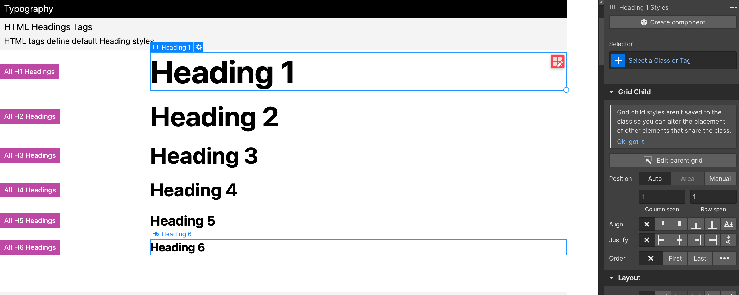
We use a class when there is a variation from the default typography style. A class changes the default typography value. For example, a global utility class such as u-text-accent.
Using Utility type classes
MAST comes with global utility typography styles to help unify, organize, and manage typography variations. The text- prefix i used throughout typography utility classes (you can view these on the style guide page).
Working with headings
Sometimes when you are working with typography the design style you are wanting to use for an element does not match the html tag you should use for SEO.
For example, you need to use an H1 tag for the page's title. The H1 is required for SEO and page crawling. However, the styles of this title should follow the H2 styles of the project. This creates a conflict where the SEO-required Heading tag needs the default styles from a different Heading tag.
You can apply h2 to the H1 element to mimic the H2 style while maintaining the H1 tag for SEO.
As another example in the image below, the text "Thanks" is featured. You do not want to use the Heading tag for this use case because it is not a Heading with relevant content. However, you need the styles from H2.
Instead of using a Heading tag for non-Heading elements, you can use a Text Element and add the h3 class to style it.
Key Takeaways
- Use text- and heading- prefixes to quickly find and use typographic utility styles (you can view these on the style guide page).
- Use the correct html tags for SEO value and if need be override the visual style using a class like h2
Sizes and rem
Webflow defaults to px units. If you type "10" into any Designer input and press "Enter", it will set "10px". MAST uses rem, which you can select in the unit dropdown.
The MAST system uses rems rather than pixels as the default unit of measurement. Using rems is an important part of web accessibility and making sure that your site is usable by anyone on the web.
Rem units are dynamic meaning that they will change based on the user's preferences for font size and possibly browser screen size, but the default conversion from pixels to rems is 16 px = 1 rem. You can do math within the webflow designer allowing you to quickly convert from one type of unit to another.
Inside the width input of Designer, type "64/16rem", press "Enter", and see the rem value calculated. You can use * to multiply / to divide, +, and - to more quickly adjust/translate spacing values if needed
For convenience, it's best to use easily readable rem values like 1, 2, 2.5, 3, 4, 5.
Avoid usage of long number values like 8.4375rem. These values are more difficult to remember and will slow you down in your workflow. For a helpful guide on recommended rem and pixel values check out this resource.
Key Takeaways
- Use rem as the default spacing value rather than pixels
- 16 px = 1 rem
- You can do math inside the designer input fields to quickly translate pixel values
Spacing Strategy
At the core of this design system is a responsive spacing strategy using variables. There is a set of variable sizes from 0.25rem to 20rem that is set up to be responsive on tablet and mobile. Use these values whenever possible (for padding, margin, flex gap, and more) to save time making layouts responsive. If for some reason the default responsive value isn't working well for a particular element you can always override the spacing on a lower breakpoint to further customize it. Note: Webflow does not show the correct rem values in the style panel on tablet and mobile, because the responsive values are controlled in the Global Styles Embed.
Using this method will make sure that both your custom classes and your utility classes retain the same spacing scale, and will allow you to easily modify the entire spacing of your site down the road by switching which size variables are referenced if needed.
Throughout this project you will see divs that have utility classes like u-mb-0 u-p-.5 or u-spacer-3 and you may want to adjust the spacing that these classes are creating. In order to do that correctly you need to know how this spacing system works.
Margin adds space outside an element, padding adds space inside an element. Spacer divs are used to add space between elements. These margin, padding and spacer classes allow you to easily and quickly add and modify spacing for elements throughout the site. The names of these classes are abbreviated to make them shorter, m = margin, p = padding and the letter afterwards refers to the direction of the margin or padding.
- mt - margin top
- mr - margin right
- pb - padding bottom
- p - padding on all sides etc...
Do not modify the values of the spacing in these classes, simply change the class to a size that is better suited. These classes are controlled by the responsive spacing variables so they will automatically resize on smaller breakpoints. If you need to make adjustments to the spacing system that should be done in the variable panel as that will update all of the classes throughout the site.
For example if you find a heading with a utility class of u-mb-1 and you want to make the spacing below the heading larger, rather than modifying the number of rems within the spacing style simply remove the u-mb-1 class and add a u-mb-2 or a u-mb-3 class instead. Once you type u-mb- into the Webflow selector field it should auto populate with options below.
If you need spacing that is specific to a particular element or has a unique way of adjusting to mobile it is best to create a custom class for that spacing, eg: contact-slide_heading-wrapper.
Whenever you are creating custom classes for a layout it is generally best to use the spacing variables rather than the utility classes because the values will stay consistent with the class rather than you needing to update each wrapper or spacer element individually if the spacing needs to change.
Key Takeaways
- Margin adds space outside an element, padding adds space inside an element.
- Use spacing variables like size/2.5 to quickly add responsive spacing to a class.
- Alternatively you can use a margin, padding, or spacer classes to quickly add spacing between elements.
- As a general rule do not modify the values of spacing in these utility classes, simply change the size class to a value that is better suited.
- If a layout requires unique spacing it can be modified on each breakpoint to override the default responsive sizing.
Resources & Acknowledgments
This website makes some modifications to the MAST system to facilitate the new Webflow variables feature (which I'm sure MAST will be updated to use down the road).
Hopefully this guide has been a helpful resource in learning how to better edit your website and also learn best practices for Webflow at the same time. If there were aspects of this that were confusing or poorly worded please reach out and let me know.
The MAST system was developed by NoCode Supply
This page was created by Caleb Raney the Webflow designer who added this system to your website, if you have more questions as you read this and are working within your website feel free to get in touch.
You can reach me at my website or by email